The Ampersound project aims to visually translate sound via typography. Thanks to an online platform conceived as a creation tool, each sound can be transcribed graphically in the form of animated posters. The Ampersound typography works on the basis that the sound makes the font vary. It is a geometrical lineal with very marked ink traps. It is provided with a large number of ligatures and alternates in order to be able to retranscribe a vast sound palette (high, low, strident, soft etc). The name of the project comes from “ampersand”. The ampersand gathers the 2 main notions of this project which are the typography & the sound. The sound modifies the layout or the global shape of the letter according to the number of decibels and the type of sound (low, high, etc). Ampersound can vary the typography in real time by taking the surrounding soundscape, by uploading a recorded sound or by making a choice from a sound gallery. The typographic variables created can then be stored in a gallery and used directly on the platform in the form of animated images (posters, record sleeves, campaigns...). This platform offers a multitude of applications for graphic designers, artists but also for the curious.
Ampersound
Universal Music Tool x Penninghen
2023
Visual Identity
Branding
Web dev
Book Design
Layout
Creativcoding
Type Design
Webdesign

BIG Issue – A Visual Identity Inspired by Editorial Layouts

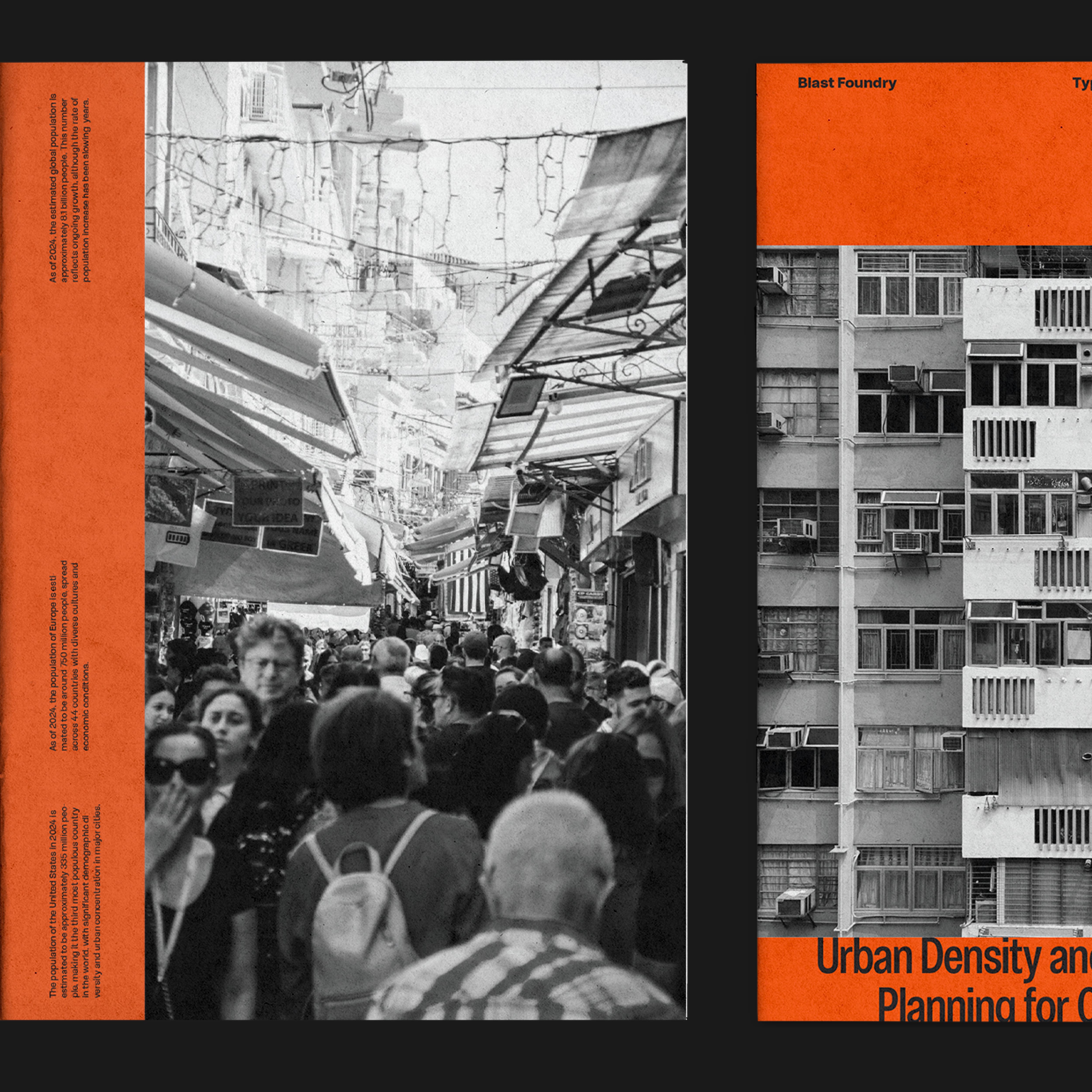
For this project, I drew inspiration from the BIG Issue typeface by Blast Foundry, originally created for the magazine of the same name. Building on the editorial layout aesthetic, I developed a visual identity that incorporates technical printing elements such as crop marks, grids, and paper textures. The goal was to stay close to the magazine’s universe while bringing a personal approach. I highlighted the typeface’s versatility—balancing tight headlines with more open body text—drawing from the visual language of journalistic layouts. This work reflects a raw, editorial spirit, blending a simple aesthetic with technical details from the print world while showcasing the flexibility and depth of this extensive type family.

Big Issue Sans
Blast Foundry
2024

BIG Issue – A Visual Identity Inspired by Editorial Layouts

For this project, I drew inspiration from the BIG Issue typeface by Blast Foundry, originally created for the magazine of the same name. Building on the editorial layout aesthetic, I developed a visual identity that incorporates technical printing elements such as crop marks, grids, and paper textures. The goal was to stay close to the magazine’s universe while bringing a personal approach. I highlighted the typeface’s versatility—balancing tight headlines with more open body text—drawing from the visual language of journalistic layouts. This work reflects a raw, editorial spirit, blending a simple aesthetic with technical details from the print world while showcasing the flexibility and depth of this extensive type family.

Big Issue Sans
Blast Foundry
2024
No items found.
No items found.
No items found.
No items found.
No items found.
No items found.
No items found.
No items found.