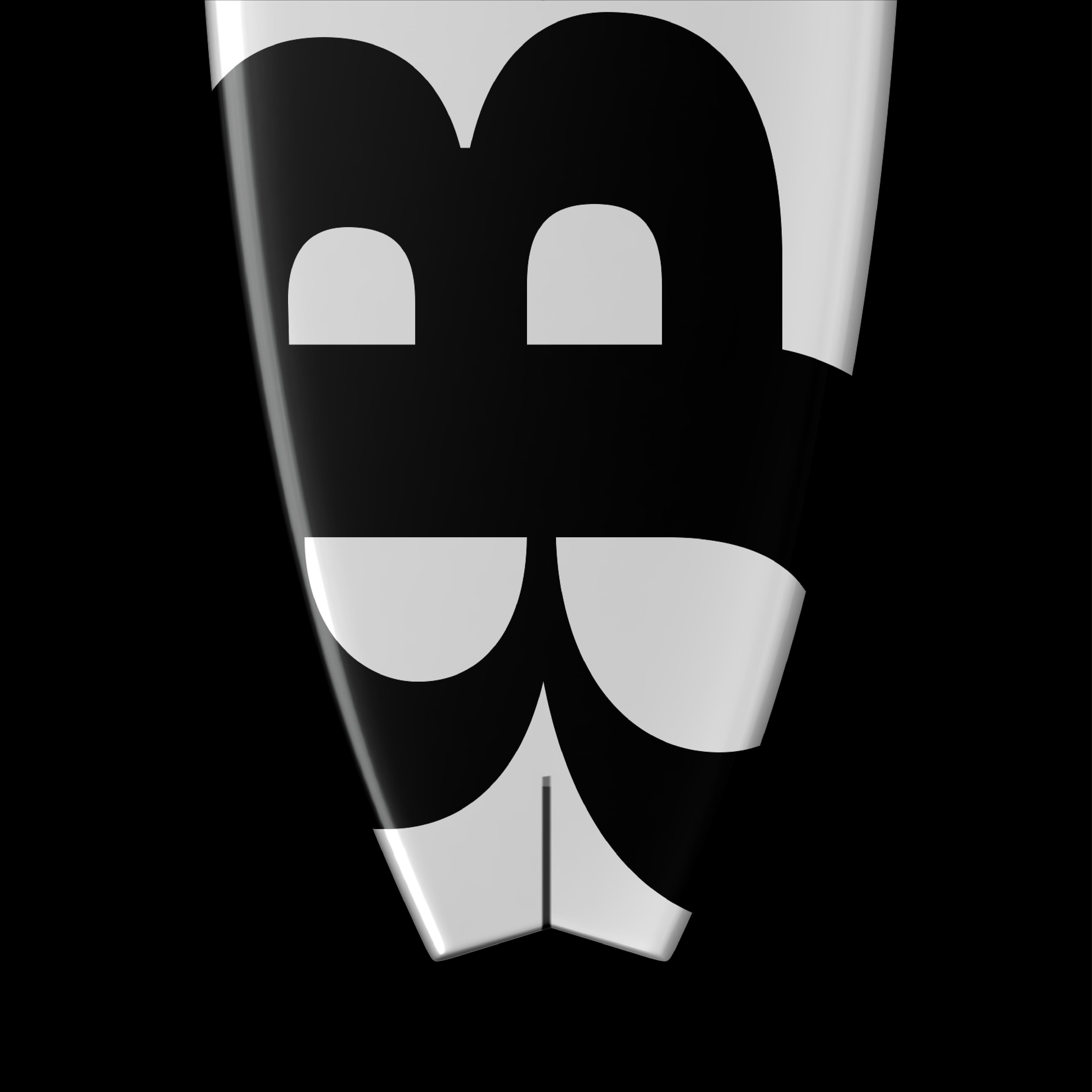
The Ampersound project aims to visually translate sound via typography. Thanks to an online platform conceived as a creation tool, each sound can be transcribed graphically in the form of animated posters. The Ampersound typography works on the basis that the sound makes the font vary. It is a geometrical lineal with very marked ink traps. It is provided with a large number of ligatures and alternates in order to be able to retranscribe a vast sound palette (high, low, strident, soft etc). The name of the project comes from “ampersand”. The ampersand gathers the 2 main notions of this project which are the typography & the sound. The sound modifies the layout or the global shape of the letter according to the number of decibels and the type of sound (low, high, etc). Ampersound can vary the typography in real time by taking the surrounding soundscape, by uploading a recorded sound or by making a choice from a sound gallery. The typographic variables created can then be stored in a gallery and used directly on the platform in the form of animated images (posters, record sleeves, campaigns...). This platform offers a multitude of applications for graphic designers, artists but also for the curious.
Ampersound
Universal Music Tool x Penninghen
2023
Visual Identity
Branding
Web dev
Book Design
Layout
Creativcoding
Type Design
Webdesign

Bay Sans – A visual identity inspired by the ocean

I developed a visual identity that aligns with its universe and inspirations. Its design, influenced by bays and aquatic movement, is reflected through fluid graphic elements that enhance the typography. The dynamic swashes of Bay Sans evoke the motion of waves, a feature I aimed to highlight through a clean and cohesive visual approach. The goal was to create a graphic environment that conveys the elegance and fluidity of the typeface while staying true to its essence.

Bay Sans
Blast Foundry
2025

Bay Sans – A visual identity inspired by the ocean

I developed a visual identity that aligns with its universe and inspirations. Its design, influenced by bays and aquatic movement, is reflected through fluid graphic elements that enhance the typography. The dynamic swashes of Bay Sans evoke the motion of waves, a feature I aimed to highlight through a clean and cohesive visual approach. The goal was to create a graphic environment that conveys the elegance and fluidity of the typeface while staying true to its essence.

Bay Sans
Blast Foundry
2025
No items found.
No items found.
No items found.
No items found.
No items found.
No items found.
No items found.
No items found.